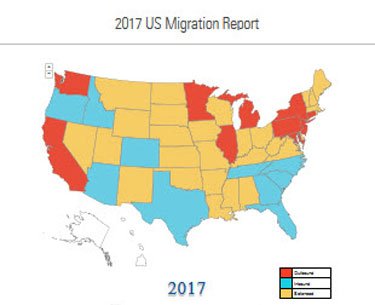
North American Moving Services 2017 American Migration Map.
Gosh, is there anything states shown in red losing the most population have in common, and anything the states shown in blue gaining the most population have in common?
Via: Seattle Sam.

|
05 Jan 2018
2017 American Migration MapDemocrat States, Population Shifts, Regulation, Republican States, Taxes
Feeds
|
Seattle Sam
All of the top states gaining population are Right-to-Work states with Republican governments. Exactly the opposite for the top outbound states (except for Michigan, which only recently changed).
Another inconvenient fact. In Illinois the people leaving the state had almost $10,000 higher average incomes than those moving into the state. But Democrats expect to solve its problems with even higher taxes. Talk about having your head in the sand.
Please Leave a Comment!