On Tuesday, Secretary of State Antony Blinken issued an order banning the use of Times New Roman font in all State Department communications.
Why is Times New Roman, which was created in 1932, suddenly so problematic? If you guessed it was because the Biden administration determined the font was racist, I wouldn’t blame you for thinking so. Given recent developments, it seemed inevitable that someone would declare that all serif fonts are tools of white supremacy.
TimesBut, believe it or not, for once, the decision actually had to do with something entirely different.
The State Department is ditching Times New Roman out of a desire to be more “inclusive” to “employees who are visually impaired or have other difficulties reading,” according to the Washington Post. The paper received a copy of the department-wide memo, which was cringingly titled “The Times (New Roman) are a-Changin.”
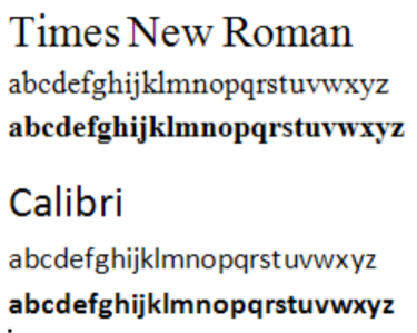
The State Department’s domestic and overseas offices have until Feb. 6 to transition from Times New Roman to the sans serif font, Calibri — which is now the new standard font for the department’s communications.
“Blinken’s cable said the shift to Calibri will make it easier for people with disabilities who use certain assistive technologies, such as screen readers, to read department communication,” explains the Washington Post. “The change was recommended by the secretary’s office of diversity and inclusion, but the decision has already ruffled feathers among aesthetic-conscious employees who have been typing in Times New Roman for years in cables and memos from far-flung embassies and consulates around the world.”


Glypto Dropem
I shall use Times New Roman forever going forward on my blog to prevent sight impaired fed bois from being able to read and analyze my posts.
Univ of Saigon 68
As I got older, I switched to Consolas font for readability in spreadsheets and documents. It takes the guesswork out of deciphering a capitol ‘I’ from a lower case ‘L’ or a capital ‘O’ from a zero (the zero has a slash through it). Much superior to the miserable Arial used on my computer. It’s an available font in Microsoft Office.
BobF
I’ve used Calibri for years, as long as I can remember. But I just tried Consolas — I like it!
bob sykes
Some of us are old enough to remember that in the typewriter era Courier was the government standard.
In fact, some computer languages (FORTAN, COBOL) required Courier because it is a mono-width font, each character whether it is “i” or “w” takes up the same width on a line, and total line width mattered: 80 uniform spaces on a Hollerith card, 132 uniform spaces on a line printer.
Boligat
“Blinken’s cable said the shift to Calibri will make it easier for people with disabilities who use certain assistive technologies, such as screen readers, to read department communication,”
Was this a wink and a nod to our new senator Fetterman from PA?
JC
Romans hated my ancestors, the Keltoi (Celtic tribes), above all other outsiders because the Celts valued freedom above everything else. With half the country viewed as outsiders by this admin, what used to be unthinkable could now actually be connectable dots. Is this what it felt like to live in the former East Germany/DDR?
Please Leave a Comment!