Category Archive 'Fonts'
19 Jan 2023

Matt Margolis:
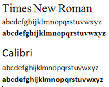
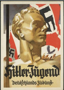
On Tuesday, Secretary of State Antony Blinken issued an order banning the use of Times New Roman font in all State Department communications.
Why is Times New Roman, which was created in 1932, suddenly so problematic? If you guessed it was because the Biden administration determined the font was racist, I wouldn’t blame you for thinking so. Given recent developments, it seemed inevitable that someone would declare that all serif fonts are tools of white supremacy.
TimesBut, believe it or not, for once, the decision actually had to do with something entirely different.
The State Department is ditching Times New Roman out of a desire to be more “inclusive” to “employees who are visually impaired or have other difficulties reading,” according to the Washington Post. The paper received a copy of the department-wide memo, which was cringingly titled “The Times (New Roman) are a-Changin.”
The State Department’s domestic and overseas offices have until Feb. 6 to transition from Times New Roman to the sans serif font, Calibri — which is now the new standard font for the department’s communications.
“Blinken’s cable said the shift to Calibri will make it easier for people with disabilities who use certain assistive technologies, such as screen readers, to read department communication,” explains the Washington Post. “The change was recommended by the secretary’s office of diversity and inclusion, but the decision has already ruffled feathers among aesthetic-conscious employees who have been typing in Times New Roman for years in cables and memos from far-flung embassies and consulates around the world.”
14 Jun 2017
Ben Hersh, at Backchannel, discusses the ability of different fonts to make cultural and political statements.
The US is not so different from the rest of the world when it comes to tribalism and conflicted identity. This has crystalized in last few months, and we’ve seen typography play a substantial role.
Hillary Clinton ran for president with a slick logo befitting a Fortune 100 company. It had detractors, but I think we’ll remember it fondly as a symbol of what could have been — clarity, professionalism, and restraint.
Donald Trump countered with a garish baseball cap that looked like it had been designed in a Google Doc by the man himself. This proved to be an effective way of selling Trump’s unique brand.
I’m not interested in whether Clinton or Trump had good logos. I’m interested in the different values they reveal. Clinton’s typography embodies the spirit of modernism and enlightenment values. It was designed to appeal to smart, progressive people who like visual puns. They appreciate the serendipity of an arrow that completes a lettermark while also symbolizing progress. In other words, coastal elites who like “design.â€
Trump’s typography speaks with a more primal, and seemingly earnest voice. “Make America Great Again†symbolizes “Make America Great Again.†It tells everyone what team you’re on, and what you believe in. Period. It speaks to a distrust of “clean†corporate aesthetics and snobs who think they’re better than Times New Roman on a baseball cap. Its mere existence is a political statement.
The two typographies are mutually intelligible at first glance, but a lot gets lost in translation. We live in a divided country, split on typographic lines as cleanly as the Serbs and the Croats.
RTWT
13 Feb 2014

Danish graphic designer Julian Hansen created the above chart to help you find a font for whatever project you might be working on. Be prepared to answer quite a few personal questions about yourself.
Hat tip to Jose Guardia.
26 Jun 2013

Chris Gayomali, in The Week, discusses the remarkable power of the properly-chosen typeface to lend authority to a text.
Type design is something we tend not to think about when we’re reading. But font can have real-world implications that affect our lives in tangible ways.
Take this somewhat famous quasi-experiment by university student Phil Renaud back in 2006 (preserved for posterity in Pastebin form). Over the course of six semesters, Renaud wrote 52 essays for his classes, earning himself a commendable A- overall.
Here’s the thing: Toward the end of his last semester, Renaud’s average essay score began climbing. “I haven’t drastically changed the amount of effort I’m putting into my writing,” he wrote. “I’m probably even spending less time with them now than I did earlier in my studies.”
What he did change, however, was his essay font — three times, in fact. Renaud went back and looked at his essay scores and the different typefaces he’d used when he submitted his work. His papers were handed to his professors in three different fonts: Times New Roman, Trebuchet MS, and Georgia.
Here’s what he tallied:

10 Jun 2008
Jason Fagone, at Stale, has an article on a program calculated to keep people like my wife out of mischief for days.
In April, an online font clearinghouse called FontShop quietly uploaded a program that, the company wrote, was meant to be “purely entertaining—something to kickstart creativity.” FontStruct, a browser tool that lets anyone create an original font, was so popular that the site’s servers crashed within days of the official launch. …
No disrespect to Adrian Frutiger—who is, of course, the Swiss graphic designer who created the Univers and Frutiger typefaces—but why would anyone want to be a little Frutiger? More broadly, why do people create their own fonts? What’s the payoff?
There’s something about that moment when your own letters begin to flash across the screen. Partly, it’s sheer childlike bliss—after all, how many hours do we spend as kids learning how to write in cursive, writing our name over and over, regarding our handwriting, hoping it’s special, stylish, distinguishable from the next kid’s? But it’s also satisfying in a distinctly grown-up way. If you’re reading this, you’re probably like me, and you have a job in which you stare at a screen all day. And it’s not even your screen. It’s somebody else’s pixels and windows and letters. Make a font and you start to screw with the scenery—the banal yet elemental DNA of your daily existence. It’s as if you could design and build your own subway turnstile or change the color of a Starbucks cup from off-white to fuchsia. Here’s a program that lets you commit a small, safe, infinitesimally subversive act and then share it with the world. FontStruct may make it worth aspiring to be a little Frutiger, after all.
/div>
Feeds
|