Category Archive 'Graphics'
31 Jul 2014

History of Human Genetic Admixture

, , ,

AncestryMap

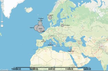
Interactive map of human genetic history

A global map detailing the genetic histories of 95 different populations across the world, showing likely genetic impacts of all sorts of events including the 13th century Mongol Invasion of Europe, has been revealed for the first time.

The interactive map, produced by researchers from Oxford University and UCL (University College London), details the histories of genetic mixing between each of the 95 populations across Europe, Africa, Asia and South America spanning the last four millennia.

The study, published this week in Science, simultaneously identifies, dates and characterises genetic mixing between populations. To do this, the researchers developed sophisticated statistical methods to analyse the DNA of 1490 individuals in 95 populations around the world. The work was chiefly funded by the Wellcome Trust and Royal Society.

Read more

The group with the longest time since admixture is detected are the Kalash from Pakistan, with an
ancient inferred event prior to 206BCE, involving mixing between a more European group, and a more
Central/South Asian group (there may also be a contribution from people carrying DNA shared with
modern-day East Asians, but we are less certain about this). Some Kalash believe they are descended
from the army of Alexander the Great, as do other groups in the region, some of whom show similar
early events–our date does not rule this out but the date range also allows for other possibilities. …

There are a number of populations that show admixture events that are not straightforward enough to
be categorized by our current analysis. For example, the French show an event involving Northern and
Southern European and North African populations dating to 1085 years ago plus or minus 300 years.
However, according to the automated quantitative criterion we developed for characterizing admixture
events, this event is characterized as “uncertain”.

From the Science Junkie via Ratak Monodosico.

27 Jul 2014

Animated Gif

, ,

02 Jul 2014

Morphing

,

Via Henry Bernatonis.

13 Feb 2014

Typeface Selection Chart

,

Danish graphic designer Julian Hansen created the above chart to help you find a font for whatever project you might be working on. Be prepared to answer quite a few personal questions about yourself.

Hat tip to Jose Guardia.

18 Jan 2014

Famous Movie Quotes as Charts

, , , ,


(sample)

Flowing data

Hat tip to Emmy Chang.

14 Jan 2014

Not a Pulp Cover

, ,

24 Oct 2013

America’s Finances

, , ,

18 Oct 2013

J002E3

, , ,

Wikipedia:

J002E3 is the designation given to a supposed asteroid discovered by amateur astronomer Bill Yeung on September 3, 2002. Further examination revealed that the surface appeared to contain the paint used on the Apollo moon rockets. The object is probably the S-IVB third stage of the Apollo 12 Saturn V rocket (serial S-IVB-507).

Via Ratak Monodosico.

27 Aug 2013

Dots

, ,

Hat tip to Madame Scherzo.

11 Jul 2013

Witty Cover

,

26 Jun 2013

The Power of Font Faces

,

Chris Gayomali, in The Week, discusses the remarkable power of the properly-chosen typeface to lend authority to a text.

Type design is something we tend not to think about when we’re reading. But font can have real-world implications that affect our lives in tangible ways.

Take this somewhat famous quasi-experiment by university student Phil Renaud back in 2006 (preserved for posterity in Pastebin form). Over the course of six semesters, Renaud wrote 52 essays for his classes, earning himself a commendable A- overall.

Here’s the thing: Toward the end of his last semester, Renaud’s average essay score began climbing. “I haven’t drastically changed the amount of effort I’m putting into my writing,” he wrote. “I’m probably even spending less time with them now than I did earlier in my studies.”

What he did change, however, was his essay font — three times, in fact. Renaud went back and looked at his essay scores and the different typefaces he’d used when he submitted his work. His papers were handed to his professors in three different fonts: Times New Roman, Trebuchet MS, and Georgia.

Here’s what he tallied:

21 May 2013

Orbiters

, ,

Your are browsing
the Archives of Never Yet Melted in the 'Graphics' Category.


Feeds
Entries (RSS)
Comments (RSS)
Feed Shark