Category Archive 'Statistics'
23 Jul 2023

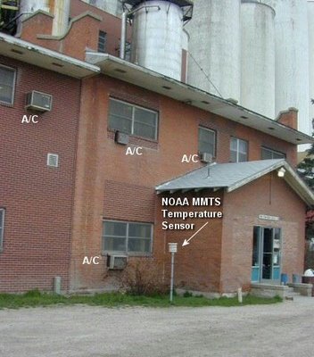
Fort Morgan, Colorado US Historical Climate Network Station. It is easy to see how urbanization can impact recorded temperature data.
BULLSHIT IN THE NEWS link
Issues & Insights identifies the key flaw in the Alarmist narrative.
The United Nation’s Intergovernmental Panel on Climate Change is quite certain Earth will be in trouble if the global temperature exceeds pre-industrial levels by 1.5 degrees Celsius or more. But how can anyone know? According to university research, “global temperature” is a meaningless concept.
“Discussions on global warming often refer to ‘global temperature.’ Yet the concept is thermodynamically as well as mathematically an impossibility,” says Science Daily, paraphrasing Bjarne Andresen, a professor at the University of Copenhagen’s Niels Bohr Institute, one of three authors of a paper questioning the “validity of a global temperature.”
Science Daily explains how the “global temperature” is determined.
“The temperature obtained by collecting measurements of air temperatures at a large number of measuring stations around the globe, weighing them according to the area they represent, and then calculating the yearly average according to the usual method of adding all values and dividing by the number of points.”
But a “temperature can be defined only for a homogeneous system,” says Andresen. The climate is not regulated by a single temperature. Instead, “differences of temperatures drive the processes and create the storms, sea currents, thunder, etc. which make up the climate”.
While it’s “possible to treat temperature statistically locally,” says Science Daily, “it is meaningless to talk about a global temperature for Earth. The globe consists of a huge number of components which one cannot just add up and average. That would correspond to calculating the average phone number in the phone book. That is meaningless.”
There are two ways to measure temperature: geometrically and mathematically. They can produce a large enough difference to show a four-degree gap, which is sufficient to drive “all the thermodynamic processes which create storms, thunder, sea currents, etc.,” according to Science Daily.
So if global temperature is unknowable, how can the IPCC and the entire industry of alarmists and activists be so sure there exists a threshold we cannot pass? Of course the IPCC says it knows the unknowable. In its latest report, released this month, it yet again maintained that the global temperature must “kept to well below 2º C, if not 1.5º C” above pre-industrial levels to avoid disaster.
A few years after the University of Copenhagen report was published, University of Guelph economist Ross McKitrick, one of the report’s authors, noted in another paper that “number of weather stations providing data . . . plunged in 1990 and again in 2005. The sample size has fallen by over 75% from its peak in the early 1970s, and is now smaller than at any time since 1919.”
“There are serious quality problems in the surface temperature data sets that call into question whether the global temperature history, especially over land, can be considered both continuous and precise. Users should be aware of these limitations, especially in policy-sensitive applications.”
RTWT
HT: Mark Tapscott.
Statistics! “There are three kinds of falsehoods, lies, damned lies, and statistics.” –Arthur Balfour.
“If I get to select both the data and the methodology of calculation, I can prove anything with statistics.” –David Zincavage.
————————
Originally posted: 18 August 2019.
01 Jun 2020

Ross Clark notes that an explanation, other than politics, is required to account for the difference in the impact of the COVID-19 virus in Asia from the toll it’s taken in Europe and the United States.
Japan… has not used any of the standard measures for tackling Covid-19 – lockdown, test, track and trace – with any great vigour. Neither has it succeeded in snuffing out the virus by any other means. If you think Boris Johnson or Donald Trump have been reckless in some way, you ought to be berating the Japanese government far more. But you won’t because Japan, in spite of its laissez-faire attitude, has had remarkably few deaths: seven for every million citizens, compared with 567 in the UK. Even Europe’s Covid pin-up – Germany – has suffered a death rate that is multiples that of Japan: 103 per million.
But then again, if you compared Japan with its Far Eastern neighbours, you could establish a case that Japan has been reckless: South Korea and Taiwan have even lower death rates at 5 per million and 0.3 per million respectively.
This brings one to an inescapable conclusion that has been obvious since mid-March, at least to anyone who has been prepared to see it: that there is a fundamental difference in the way that this virus has behaved in the Far East compared with Europe and America. It has been far, far deadlier in the latter two, and in a way which cannot even nearly be explained by the way different governments have handled the epidemic. This raises two possibilities: either there is a difference in the virus that has been attacking Western countries or there is a difference in the human populations.
RTWT
18 Mar 2020

John P.A. Ioannidis, professor of medicine, of epidemiology and population health, of biomedical data science, and of statistics at Stanford University and co-director of Stanford’s Meta-Research Innovation Center, warns that, as is very much standard operating procedure in the modern world, we are making serious decisions treating totally unreliable statistics as facts.
The data collected so far on how many people are infected and how the epidemic is evolving are utterly unreliable. Given the limited testing to date, some deaths and probably the vast majority of infections due to SARS-CoV-2 are being missed. We don’t know if we are failing to capture infections by a factor of three or 300. Three months after the outbreak emerged, most countries, including the U.S., lack the ability to test a large number of people and no countries have reliable data on the prevalence of the virus in a representative random sample of the general population.
This evidence fiasco creates tremendous uncertainty about the risk of dying from Covid-19. Reported case fatality rates, like the official 3.4% rate from the World Health Organization, cause horror — and are meaningless. Patients who have been tested for SARS-CoV-2 are disproportionately those with severe symptoms and bad outcomes. As most health systems have limited testing capacity, selection bias may even worsen in the near future.
The one situation where an entire, closed population was tested was the Diamond Princess cruise ship and its quarantine passengers. The case fatality rate there was 1.0%, but this was a largely elderly population, in which the death rate from Covid-19 is much higher.
Projecting the Diamond Princess mortality rate onto the age structure of the U.S. population, the death rate among people infected with Covid-19 would be 0.125%. But since this estimate is based on extremely thin data — there were just seven deaths among the 700 infected passengers and crew — the real death rate could stretch from five times lower (0.025%) to five times higher (0.625%). It is also possible that some of the passengers who were infected might die later, and that tourists may have different equencies of chronic diseases — a risk factor for worse outcomes with SARS-CoV-2 infection — than the general population. Adding these extra sources of uncertainty, reasonable estimates for the case fatality ratio in the general U.S. population vary from 0.05% to 1%.
That huge range markedly affects how severe the pandemic is and what should be done. A population-wide case fatality rate of 0.05% is lower than seasonal influenza. If that is the true rate, locking down the world with potentially tremendous social and financial consequences may be totally irrational. It’s like an elephant being attacked by a house cat. Frustrated and trying to avoid the cat, the elephant accidentally jumps off a cliff and dies.
RTWT
We have a serious problem in the fact that most people, including the overwhelming majority of people in positions of power and responsibility do not understand math and think that statistical estimates and projections constitute scientific fact. How many times have you heard the network news talking head gravely report that “We know there are only [pick a number] of [pick an allegedly Endangered Species] left”?
Only old people like myself remember today the 1976 Swine Flu Epidemic Panic that Gerald Ford presided over which, when the whole thing petered out into a non-event, left the President and official Washington looking ridiculous.
HT: Frank Dobbs.
18 Aug 2019
Fort Morgan, Colorado US Historical Climate Network Station. It is easy to see how urbanization can impact recorded temperature data.
Issues & Insights identifies the key flaw in the Alarmist narrative.
The United Nation’s Intergovernmental Panel on Climate Change is quite certain Earth will be in trouble if the global temperature exceeds pre-industrial levels by 1.5 degrees Celsius or more. But how can anyone know? According to university research, “global temperature” is a meaningless concept.
“Discussions on global warming often refer to ‘global temperature.’ Yet the concept is thermodynamically as well as mathematically an impossibility,” says Science Daily, paraphrasing Bjarne Andresen, a professor at the University of Copenhagen’s Niels Bohr Institute, one of three authors of a paper questioning the “validity of a global temperature.”
Science Daily explains how the “global temperature” is determined.
“The temperature obtained by collecting measurements of air temperatures at a large number of measuring stations around the globe, weighing them according to the area they represent, and then calculating the yearly average according to the usual method of adding all values and dividing by the number of points.”
But a “temperature can be defined only for a homogeneous system,” says Andresen. The climate is not regulated by a single temperature. Instead, “differences of temperatures drive the processes and create the storms, sea currents, thunder, etc. which make up the climate”.
While it’s “possible to treat temperature statistically locally,” says Science Daily, “it is meaningless to talk about a global temperature for Earth. The globe consists of a huge number of components which one cannot just add up and average. That would correspond to calculating the average phone number in the phone book. That is meaningless.”
There are two ways to measure temperature: geometrically and mathematically. They can produce a large enough difference to show a four-degree gap, which is sufficient to drive “all the thermodynamic processes which create storms, thunder, sea currents, etc.,” according to Science Daily.
So if global temperature is unknowable, how can the IPCC and the entire industry of alarmists and activists be so sure there exists a threshold we cannot pass? Of course the IPCC says it knows the unknowable. In its latest report, released this month, it yet again maintained that the global temperature must “kept to well below 2º C, if not 1.5º C” above pre-industrial levels to avoid disaster.
A few years after the University of Copenhagen report was published, University of Guelph economist Ross McKitrick, one of the report’s authors, noted in another paper that “number of weather stations providing data . . . plunged in 1990 and again in 2005. The sample size has fallen by over 75% from its peak in the early 1970s, and is now smaller than at any time since 1919.”
“There are serious quality problems in the surface temperature data sets that call into question whether the global temperature history, especially over land, can be considered both continuous and precise. Users should be aware of these limitations, especially in policy-sensitive applications.”
RTWT
HT: Mark Tapscott.
Statistics! “There are three kinds of falsehoods, lies, damned lies, and statistics.” –Arthur Balfour.
“If I get to select both the data and the methodology of calculation, I can prove anything with statistics.” –David Zincavage.
04 Oct 2017

Leah Libresco Y ’11,, a statistician and former newswriter at FiveThirtyEight, a data journalism site, looks rationally at Gun Control arguments.
Before I started researching gun deaths, gun-control policy used to frustrate me. I wished the National Rifle Association would stop blocking common-sense gun-control reforms such as banning assault weapons, restricting silencers, shrinking magazine sizes and all the other measures that could make guns less deadly.
Then, my colleagues and I at FiveThirtyEight spent three months analyzing all 33,000 lives ended by guns each year in the United States, and I wound up frustrated in a whole new way. We looked at what interventions might have saved those people, and the case for the policies I’d lobbied for crumbled when I examined the evidence. The best ideas left standing were narrowly tailored interventions to protect subtypes of potential victims, not broad attempts to limit the lethality of guns. …
As my co-workers and I kept looking at the data, it seemed less and less clear that one broad gun-control restriction could make a big difference. Two-thirds of gun deaths in the United States every year are suicides. Almost no proposed restriction would make it meaningfully harder for people with guns on hand to use them. I couldn’t even answer my most desperate question: If I had a friend who had guns in his home and a history of suicide attempts, was there anything I could do that would help?
However, the next-largest set of gun deaths — 1 in 5 — were young men aged 15 to 34, killed in homicides. These men were most likely to die at the hands of other young men, often related to gang loyalties or other street violence. And the last notable group of similar deaths was the 1,700 women murdered per year, usually as the result of domestic violence. Far more people were killed in these ways than in mass-shooting incidents, but few of the popularly floated policies were tailored to serve them.
By the time we published our project, I didn’t believe in many of the interventions I’d heard politicians tout. I was still anti-gun, at least from the point of view of most gun owners, and I don’t want a gun in my home, as I think the risk outweighs the benefits. But I can’t endorse policies whose only selling point is that gun owners hate them. Policies that often seem as if they were drafted by people who have encountered guns only as a figure in a briefing book or an image on the news.
Instead, I found the most hope in more narrowly tailored interventions.
RTWT
31 Mar 2017
Breitbart has some really bad news.
Fewer than 1 percent of papers published in scientific journals follow the scientific method, according to research by Wharton School professor and forecasting expert J. Scott Armstrong.
Professor Armstrong, who co-founded the peer-reviewed Journal of Forecasting in 1982 and the International Journal of Forecasting in 1985, made the claim in a presentation about what he considers to be “alarmism†from forecasters over man-made climate change.
“We also go through journals and rate how well they conform to the scientific method. I used to think that maybe 10 percent of papers in my field … were maybe useful. Now it looks like maybe, one tenth of one percent follow the scientific method†said Armstrong in his presentation, which can be watched in full below. “People just don’t do it.â€
Armstrong defined eight criteria for compliance with the scientific method, including full disclosure of methods, data, and other reliable information, conclusions that are consistent with the evidence, valid and simple methods, and valid and reliable data.
According to Armstrong, very little of the forecasting in climate change debate adheres to these criteria. “For example, for disclosure, we were working on polar bear [population] forecasts, and we were asked to review the government’s polar bear forecast. We asked, ‘could you send us the data’ and they said ‘No’… So we had to do it without knowing what the data were.â€
According to Armstrong, forecasts from the Intergovernmental Panel on Climate Change (IPCC) violate all eight criteria.
“Why is this all happening? Nobody asks them!†said Armstrong, who says that people who submit papers to journals are not required to follow the scientific method.

A must-read.
17 Jul 2014

Network combining the five major Icelandic sagas. White nodes represent characters who appear in more than one saga. There is a large overlap of characters from Laxdæla Saga (green) and Njáls Saga (red). The other sagas are Egil (blue), Vatnsdaela (yellow), and Gisla (light blue).
Veronique Greenwood, at the Verge, describes a fascinating application of the techniques of statistical physics to identify patterns and relationships in medieval literature.
An unusual article recently appeared in the magazine of the Royal Statistical Society and American Statistical Association.
It featured web-like diagrams of lines connecting nodes, a hallmark of research that analyzes networks. But each node, rather than being a plain dot, was the head of a burly, red-bearded Viking sporting a horned hat, his tresses blowing in the wind.
This whimsical-seeming piece of scholarship went on to describe the social network of more than 1,500 characters in the Icelandic Sagas, epic tales about the colonization of Iceland around a thousand years ago that were first written down a few hundred years after that. It was the work of a pair of statistical physicists, Ralph Kenna of University of Coventry in the UK and his graduate student Pádraig Mac Carron, now at Oxford, who are applying the tools of their trade to works of epic literature, legend, and myth.
For this particular analysis, they painstakingly recorded the relationship of every settler in 18 sagas. The resulting web of interactions helped shed light on theories humanities scholars have been discussing for years, and even picked up on some previously unnoticed patterns. Their work is part of a movement that promises a new way to approach old questions in literature, history, and archaeology, with fanciful diagrams as just the appetizer.
Demonstration of social network analysis, with red lines representing unfriendly connections and green lines representing friendly ones.
The story of how Kenna and Mac Carron got here begins with the Irish tale of the cattle-raid of Cooley, or the Táin Bó Cúailnge. That yarn tells how the warrior-queen Medb of Connacht rallies an army to steal a fine bull from Ulster, and how youthful Cúchulainn, an Ulster folk hero, stands against her. Complete with a maiden prophet with three pupils in each eye, wild chariot rides, and an enormous cast of characters, it’s a story to grip anyone’s imagination.
It’s a story that Kenna and Mac Carron, who are both Irish, have known since childhood. Several years ago, Kenna, who has a successful career as a physicist, found his thoughts returning to mythology. It wasn’t as big a departure as it might seem at first. “In statistical physics, you’re dealing with objects such as gasses that are comprised of molecules and atoms,” he says. “The system consists of many small entities, and so many of them you cannot deal with them individually, you have to deal with them statistically.” Some physicists have started to use similar methods to look at how large numbers of people interact to produce aspects of human society, and Kenna wondered whether they could be applied to myths and stories. The Táin, which comes to us in pieces from many different manuscripts, the oldest nearly 1,000 years old, is considered literature rather than historical account. But it might still encode, in a way statistics can reveal, information about the society that produced it. Math might also help classify tales in a new way, quantitatively, in addition to the usual qualitative classifications.
Hat tip to Karen L. Myers.
27 May 2014

In the Wall Street Journal, Joseph Bast and Roy Spencer look at the evidence, and find that the oft-repeated claim that “97% of climate scientists” subscribe to a belief in Catastrophist Anthropogenic Warmism is just as empty a claim as the newspaper headlines about melting glacier and Polar icecaps.
Last week Secretary of State John Kerry warned graduating students at Boston College of the “crippling consequences” of climate change. “Ninety-seven percent of the world’s scientists,” he added, “tell us this is urgent.”
Where did Mr. Kerry get the 97% figure? Perhaps from his boss, President Obama, who tweeted on May 16 that “Ninety-seven percent of scientists agree: #climate change is real, man-made and dangerous.” Or maybe from NASA, which posted (in more measured language) on its website, “Ninety-seven percent of climate scientists agree that climate-warming trends over the past century are very likely due to human activities.”
Yet the assertion that 97% of scientists believe that climate change is a man-made, urgent problem is a fiction. The so-called consensus comes from a handful of surveys and abstract-counting exercises that have been contradicted by more reliable research.
One frequently cited source for the consensus is a 2004 opinion essay published in Science magazine by Naomi Oreskes, a science historian now at Harvard. She claimed to have examined abstracts of 928 articles published in scientific journals between 1993 and 2003, and found that 75% supported the view that human activities are responsible for most of the observed warming over the previous 50 years while none directly dissented.
Ms. Oreskes’s definition of consensus covered “man-made” but left out “dangerous”—and scores of articles by prominent scientists such as Richard Lindzen, John Christy, Sherwood Idso and Patrick Michaels, who question the consensus, were excluded. The methodology is also flawed. A study published earlier this year in Nature noted that abstracts of academic papers often contain claims that aren’t substantiated in the papers.
Read the whole thing.
14 May 2014
Divorce rate in Maine
correlates with
Per capita consumption of margarine (US)
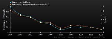
Correlation: 0.992558
Amusing web-site mocks statistical evidence by posting a daily graph and quantitative data demonstrating a meaningless correlation between two totally unconnected collections of events.
Hat tip to Scott Drum.
Your are browsing
the Archives of Never Yet Melted in the 'Statistics' Category.
/div>

Feeds
|